Spread Betting and CFDs are complex instruments and come with a high risk of losing money rapidly due to leverage. 64.3% of retail investor accounts lose money when trading Spread Betting and CFDs with this provider. You should consider whether you understand how Spread Betting and CFDs work and whether you can afford to take the high risk of losing your money
How do you read a candlestick chart? – Trading Guides
What are candlestick charts?
Candlestick Charts display information, and different chart types provide different levels of information. the vast majority plot price against time, but can vary in complexity.
JAPANESE CANDLESTICKS
Japanese candlestick charts bring a level of complexity. They are probably the most popular method of visually representing price movement. No doubt this is because each candlestick contains a considerable amount of information in a very clear format. For any given period – which could be for instance a minute, an hour, a day, week or month – Japanese candlesticks tell you pictorially where the market opened as well as its high, low and close. In this they are similar to OLHC charts. However they also help to highlight the strength of the move. The colour of the body of the candle tells you at a glance if the market rose or fell. Then a series of candles can develop into a pattern which can signal if a market is likely to continue to move in a particular direction, or if a reversal is on the cards. Japanese candlesticks make it easy to see when a market is trending in a particular direction, while also giving a good indication of the strength of the move.
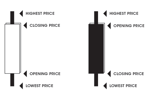
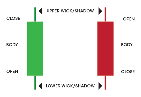
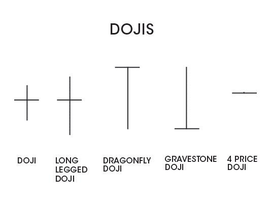
While an individual candle displays a wealth of price information, it’s important not to make a trading decision based on the presence of one candlestick in isolation. But within a sequence, the presence of a certain candle or a particular grouping of candles can often indicate that a market trend is likely to continue or if a reversal is on the cards. For instance, Doji candles – when the open and close are at practically the same level, giving a candle with no body – are particularly important candle shapes.
Followers of Japanese candlestick charting are always on the lookout for Dojis, as they can, in certain situations, signal that a trend is about to reverse. The thinking is that neither the bulls nor bears are in overall control of the market. In other words, there is general indecision.
What do doji candlesticks look like?
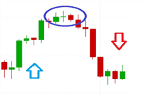
In this example we can see how the market was rising but then changed direction after a Doji candlestick materialised. Now it’s very important to appreciate that the appearance of a Doji alone won’t guarantee a change in market direction. However, it is worth looking out for such candles along with other technical indicators and drawing tools.
HAMMER AND HANGING MAN CHARTS
Other significant candle shapes and patterns include the “Hammer” and “Hanging Man.”
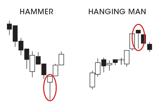
The “Hammer/Hanging Man” has a short body at the top of the candlestick with a long lower wick (typically at least twice as long as the body) and either a short or no upper wick. When this candlestick appears it can indicate that a reversal is imminent. When it appears during a downtrend it is called a “Hammer.” In this situation the long lower wick shows that sellers had originally managed to push prices lower. However, buyers subsequently stepped in to drive the market up. This would suggest that the bulls took back control towards the end of the trading period.
Candlestick traders will consider this price action alongside data on trading volumes. If volumes are increasing as the candle is formed then it suggests that buyers are taking control. If the market opens higher in the next period, then candlestick traders will look to enter the market on the long side.
When prices are trending higher, then this shaped candle is called a “Hanging Man.” Candlestick traders will be on the lookout for its appearance as it can signal a reversal where prices are about to turn lower. However, in this scenario it is extremely important to obtain additional confirmation that a trend reversal may take place. This is because the “Hanging Man” may be indicating that the buying momentum may be waning, but it still shows that buyers managed to push prices back off their lows.
Further confirmation of a trend reversal would be if the subsequent candle closes below, or near to the tail, of the main body of the “Hanging Man.” Rising trade volume would also support the view that sellers were gaining the upper hand.
What other charts are there in trading?
The simpler to read charts are known as line charts and OHLC charts.
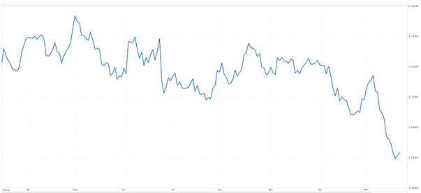
Below is a line chart which simply records the consecutive closing prices of an instrument for a specific time period:
Line charts
Below is a line chart which simply records the consecutive closing prices of an instrument for a specific time period:
A chart like this will show the observer how price has moved over time, and may help to establish whether a financial instrument is range-bound or trending, but not much else.
Open-high-low-and-close (ohlc) chart
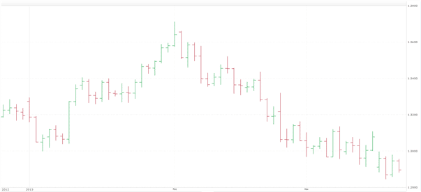
Then we have an “open-high-low-and-close” (OHLC) chart which is also known as a “bar chart”. This gives considerably more information. From a single bar it’s possible to tell the open, high, low, close and direction of movement for a given period. A bar can represent anything from a month to a minute.
Disclaimer
Spread Co is an execution only service provider. The material on this page is for general information purposes only and nothing contained herein constitutes (or should be taken to constitute) financial or other advice which should be relied upon. It has not been prepared with your personal circumstances, financial situation, needs or objectives in mind, therefore any actions taken or not taken by any person on the basis of this material is done entirely at their own risk. Spread Co accepts no responsibility whatsoever for any such actions, inactions or resulting consequences. No opinion expressed in the material shall amount to (or be taken to amount to) an endorsement, recommendation or other such affirmation of the suitability or unsuitability of any particular investment, transaction, strategy or approach for any specific person. This material has not been prepared in accordance with legal requirements designed to promote the independence of investment research and is considered a marketing communication. As such, this communication is not subject to any prohibition on dealing ahead of the dissemination of investment research. Nonetheless, Spread Co operates a conflict of interest policy to prevent the risk of material damage to our clients.
Recent guides
Easy To Open An Account
Reliable Platform
With our platforms you can trade wherever you are – at home, in the office, or when you’re out and about.
0% financing on short index positions
Some companies will charge you to hold a short index position. At Spread Co we won’t.
Powerful Charting
Spread Co charts are powered by TradingView Inc.
Sign Up For A Demo Account Create A Live AccountStart here
Markets
Spread Co Limited is a limited liability company registered in England and Wales with its registered office at 22 Bruton Street, London W1J 6QE. Company No. 05614477. Spread Co Limited is authorised and regulated by the Financial Conduct Authority. Register No. 446677.